Shot List
- On the cover - Main Image of the featured artist on the cover.
- Contents page - Pictures of other artists. 3 artists on the contents page as well as another image of the featured artist.
- Double page spread - Main image of the artist on the page and also featuring a scanned in image of the artist as a child.
Double page spread plan.- Photographs will be a main feature photo of the artist, but also I will use a photo of the artist when they was younger to scan into the computer and put onto the page.
- My photos will be in black and white. This is because my double page spread will be focused on revealing all about the artist therefore I feel the simplistic black and white photos will be relevant to the copy, showing the artist stripped down.
- The copy of my double page spread will begin with an introduction on the background of the artist, then follow with an interview.
- I would like to include a quote from the artist as the title of the page.
- On my page I would also like to include a feature box showing the upcoming music from the artist.
Plan for the week
- Make a mood board/collage with examples of magazines.
- Begin some of my photos for the contents page.
- Plan stories for the cover.
- Interview model for the double page spread.
- Find examples of double page spreads to help choose a layout.
 This is the final design for my masthead with the name I have chosen 'Scarred'.
I have used the font scratched punk as I feel this font can be associated with the rock genre. Not only this but I also chose this font as the font almost looks 'scarred' with the marks on it.
I chose the title 'Scarred' as it gives quite dark connotations. Scarred also links with the idea of tattoos which is also related to the rock genre.
- Old run down areas
- Dark areas
- Staircases
- Music Studio
- Pathways

These are some test shots done to see the different props that could be used for my magazine.

Costumes Model 1 (Cover & Double page spread)
Red top (matching the masthead)
Only part of outfit showing is a vest top (used to show model tattoos)
Costumes Model 2 (contents page)
Costume Model 3 (Contents page)


Equipment/Software List
- Imac Computers
- Cameras
- Video Cameras
- Editing Software
- Photoshop
- Indesign
- Internet
- Scanner
- Printer
- Ishow you
 This is the schedule I have made for the production of my music magazine.

Double Page Spread Analysis
- The story used is of the band 'My Chemical Romance' discussing their new album and future plans. The story also includes an insight into the album showing a few of their new songs and what they're about. The language used is very informal and appeals to a younger audience. Using the speech from the artists helps portray the genre with one artist saying 'Oh it's filthy', which is also an informal way of speech.
- The story of the magazine is for people who are interested in artists and their music, the article is very factual as appose to gossip about the artists lives.
- By the genre we can tell the target audience are people with an interest in the rock genre, but also an age range of a student age.
- The layout of the page is the use of a Masthead which is a quote from the band taken from the article. The main story is surrounded by pictures which are relevant to the article on the band. The article is set out in two columns which is the correct layout for a magazine. There is also a column down the side which stands out from the page as it is being used to show their new songs, which the article is being used to promote. This would be useful to include on my double page spread as mine is going to be based on a new upcoming artist.
- The images used are relevant to the copy as the copy is about the artists with their new album, about them in the recording studio and touring their new album, which is what the pictures show. All the images are black and white which make the page look a lot more professional. The images are also in relevant location for example, in the recording studio or at gigs.
- The artists in the images are also wearing things which are relevant to their genre but also the darkness of their clothing portrays the rock genre.
- The colours used are continuous on the page, the use of, Black, White and Red, then also the Black and White photographs. The colours are not only all associated with each other on the page but also associated with the genre as I found from my questionnaire research Black, White and Red are associated with a Rock magazine.


 I like how this double page spread has a featured box on the imagine which has facts on the band. I would like to use this on my magazine as it is a good attractive feature for a double page spread.
 I like how this double page spread has lots of images relevant to the band for example live shots of the band. However I would like the copy relevant to the page to be a bit longer.
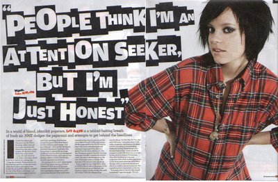 I like the layout of this double page spread how the models photo is the main feature getting the readers attention. The image is relevant to the copy which makes the double page spread work. I like the idea of using a quote from the artist as a title for the double page spread.
 This is the final design for my masthead with the name I have chosen 'Scarred'.
 This is the schedule I have made for the production of my music magazine.


